DS color design
Rebuilding the color palette for Achieve from the ground up. Focusing on accessibility and usability for the design team.
(Client)
Achieve
(Year)
2023
(Skills)
DS
Accessibility
DS color design
Rebuilding the color palette for Achieve from the ground up. Focusing on accessibility and usability for the design team.
(Client)
Achieve
(Year)
2023
(Skills)
DS
Accessibility
DS color design
Rebuilding the color palette for Achieve from the ground up. Focusing on accessibility and usability for the design team.
(Client)
Achieve
(Year)
2023
(Skills)
DS
Accessibility


(Context)
(Overview)
Side project to color system
This was a personal project that later gained traction and eventually became the color scales for our entire design system
(Role)
Design lead
After I pitched the project to our team I gained the backing of design leadership and began to work with our DS team lead.
(Solution)
Accessible and structured colors
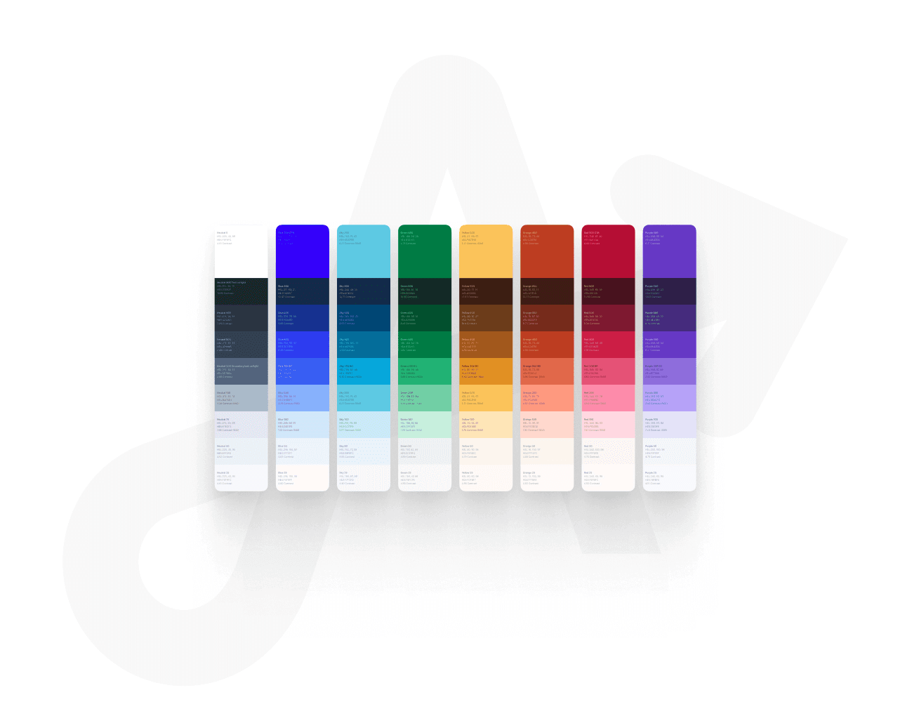
The new colors are simpler, more functional, more ordered and more structured. They are designed to compliment our extremely bright blue primary color.
(Results)
(KPI)
39
%
Less colors
(KPI)
200
%
Accessible combinations
(KPI)
100
%
Adoption
(Results)
39
%
Less colors
200
%
Accessible combinations
100
%
Adoption
(Results)
(KPI)
39
%
Less colors
(KPI)
200
%
Accessible combinations
(KPI)
100
%
Adoption


(Context)
(We believed)
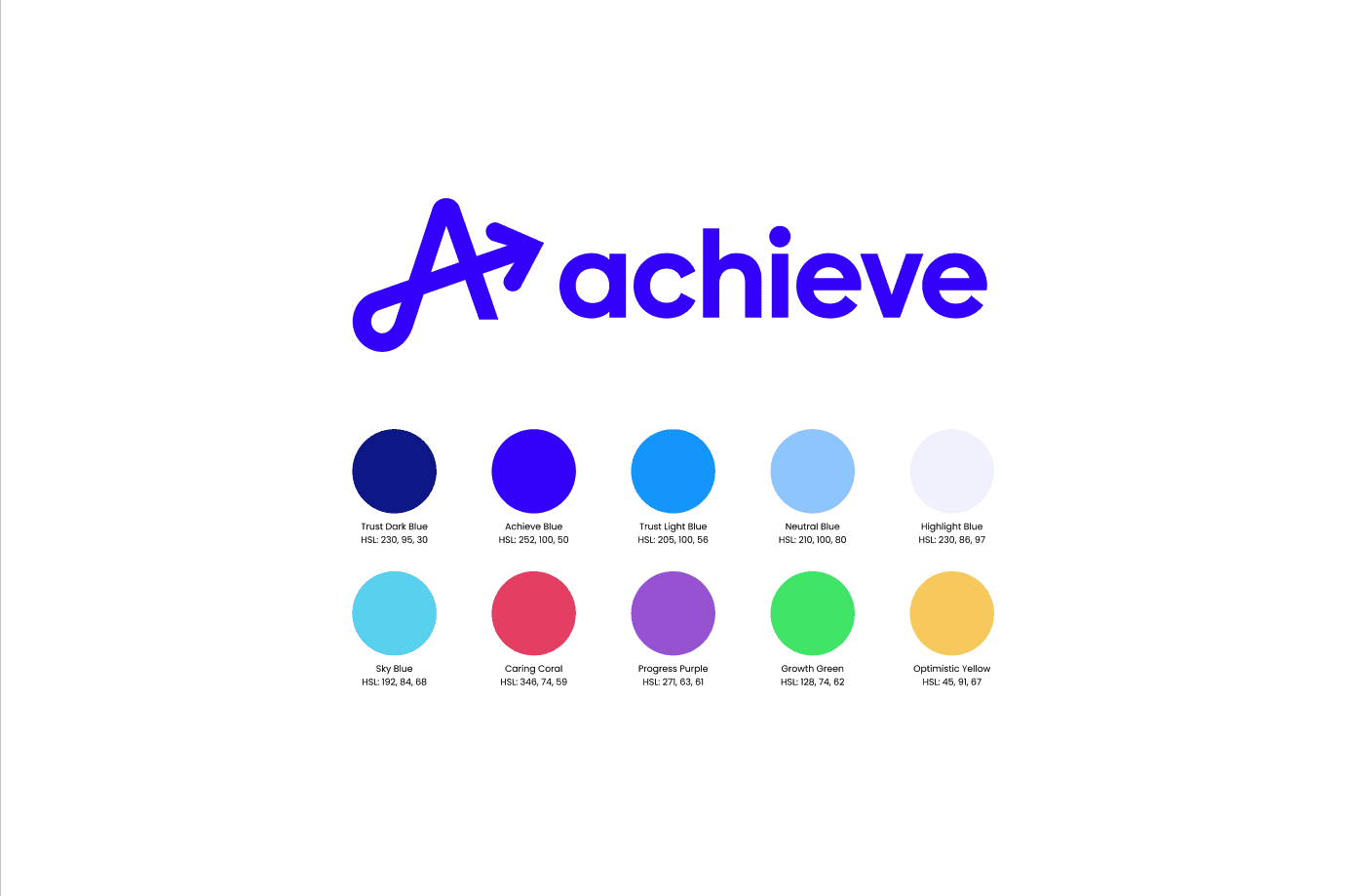
We needed complimentary but functional colors. The blue made it a challenge.
Although we had brand colors, they were very bright, and in some critical cases, as with our green, the colors made accessibility challenging. Further the blue we started is one of the darkest most saturated colors in the color spectrum.

How might we compliment an incredibly strong color

How might we compliment an incredibly strong color

How might we compliment an incredibly strong color


(Context)
(We believed)
Our first color palette was only partially successful
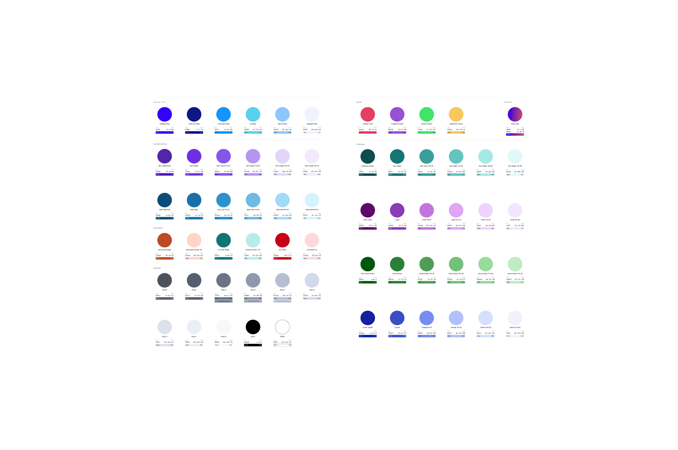
Our team attempted to move quickly and added colors to the DS as needed. However this meant that there was a lack of structure. I found it hard to use and therefore began to create another palette as a side project.
(we understood)
We needed structure and simplicity
It was my opinion that our color palette was not as useful or effective as it could be. Mainly the colors did not follow an ordered pattern and deciding to change an exploration from blue to yellow for instance meant redoing all color selections from the ground up. The blue we chose looks very purple at the lighter end of its tints. Finally we had several colors which functionally were very similar, this made choosing and understanding colors semantically for both designer and user alike was challenging. Most importantly the lack of color structure meant that very few color combinations looked good or were accessible. This limited the team greatly.


(Define)
(Four)
Key elements
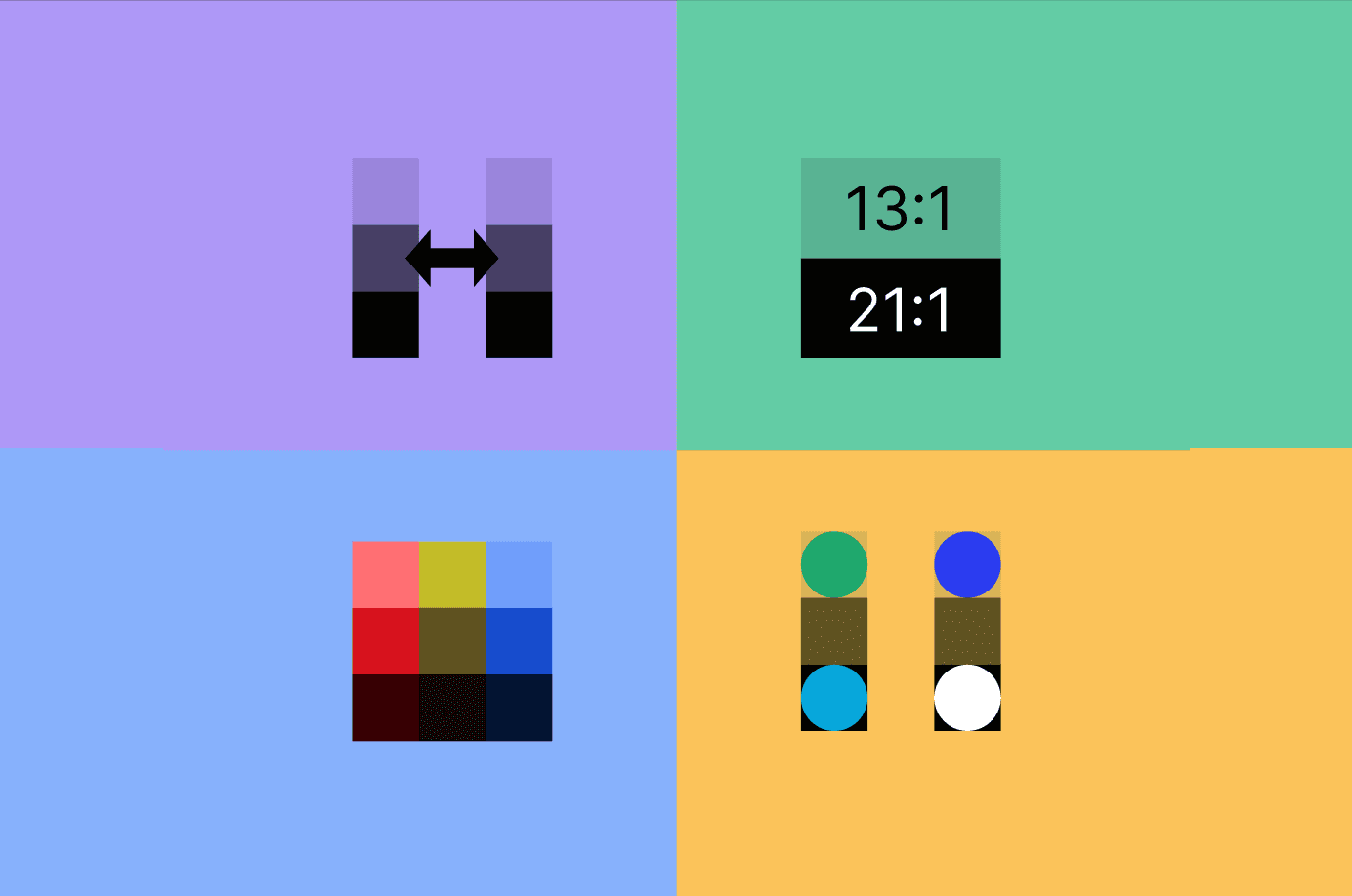
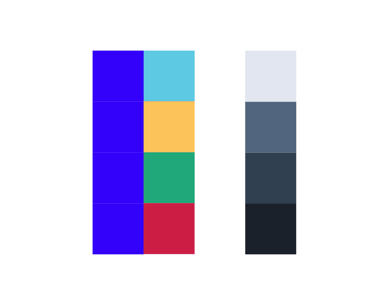
I identified four key areas for improvement for a new color palette. We would have structured shades so that a designer could move from one color to another and be confident in a similar level of contrast. We would have contrast ratios baked in to make accessibility easier, the colors would be desaturated to not clash with our bright primary color, and we would target the hues and shades so that they would be functional but also very close to our brand guidelines.


(Deliver)
(Milestone 1)
First draft
In my down time I built the first version of a new color palette. This palette primary secondary neutrals, error warning and success colors each with 9 shades and tints.
(Deliver)
(Milestone 1)
First draft
In my down time I built the first version of a new color palette. This palette primary secondary neutrals, error warning and success colors each with 9 shades and tints.
(Deliver)
(Milestone 1)
First draft
In my down time I built the first version of a new color palette. This palette primary secondary neutrals, error warning and success colors each with 9 shades and tints.

Continuous team feedback
(Understand)
(Build confidence)
Checking to see if others felt similarly
After building out the color palette and testing on my own projects I brought up my ideas with a small group of other teammates. It turns out they had some of the same challenges with our older design system. At this point I brought up the concept to leadership and the project moved from side project to primary design system effort
(Refine)
Continuous feedback
Thus began a fairly exhaustive effort to test the designs with every design pod and nearly every designer. We listened to the illustration team to adjust yellows, to the DS leads to refine our warning tones, to the front end web team to build out a set of purples and so on.


(Refine)
(Testing)
Black and white
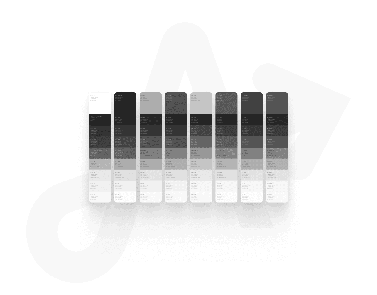
One very helpful method for quickly assessing the goals of a uniform set of steps in the shades was to convert the colors to black and white. This way at a glance we could see if the colors were looking too bright or too dark for each step in our shade scale.
(Refine)
(Testing)
Black and white
One very helpful method for quickly assessing the goals of a uniform set of steps in the shades was to convert the colors to black and white. This way at a glance we could see if the colors were looking too bright or too dark for each step in our shade scale.
(Refine)
(Testing)
Black and white
One very helpful method for quickly assessing the goals of a uniform set of steps in the shades was to convert the colors to black and white. This way at a glance we could see if the colors were looking too bright or too dark for each step in our shade scale.


(Deliver)
(Milestone 2)
Review in context
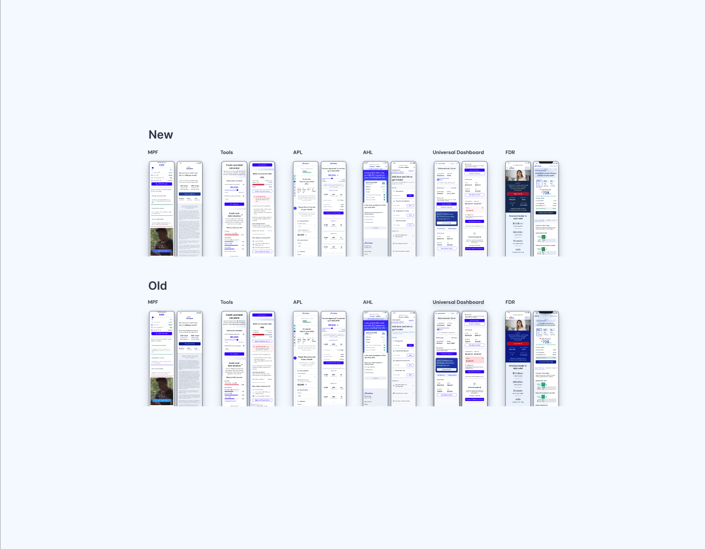
The last step was to take key screens from every design pod and apply the new colors. This way we could review the benefits and refine any areas where there may be weaknesses.
(Deliver)
(Milestone 2)
Review in context
The last step was to take key screens from every design pod and apply the new colors. This way we could review the benefits and refine any areas where there may be weaknesses.
(Deliver)
(Milestone 2)
Review in context
The last step was to take key screens from every design pod and apply the new colors. This way we could review the benefits and refine any areas where there may be weaknesses.

"Dude, the colors you came up with, so good, so so good"
(Deliver)
(Success)
Business impact, final thoughts
While it is hard to measure the impact of the colors, there are some key changes we can be sure of. The new colors allow our designs to much more easily adhere to WCAG standards and to legal accessibility standards. And lastly we were able to pull metrics when looking at the number of colors prior and after. With less colors but more accessible and aesthetic color combinations we are able to more effectively communicate our brand to our users, while being more accessible and also much easier to use for our design team.
(Results)
(KPI)
39
%
Less colors
(KPI)
200
%
Accessible combinations
(KPI)
100
%
Adoption
(Results)
39
%
Less colors
200
%
Accessible combinations
100
%
Adoption
(Results)
(KPI)
39
%
Less colors
(KPI)
200
%
Accessible combinations
(KPI)
100
%
Adoption